AltMilk Magazine 2023
Branding, Logo Design, UI/UX
I crafted the brand identity for Alt Milk Mag to be bold, subversive, and unapologetically disruptive—a visual reflection of the magazine’s rebellious stance against mainstream culture. The design process began with user research and competitive analysis, identifying a niche audience of creative outsiders who crave thought-provoking content wrapped in an aesthetically striking format. Inspired by zines, brutalist design, and underground media, the brand language needed to be clean yet raw, structured yet irreverent.
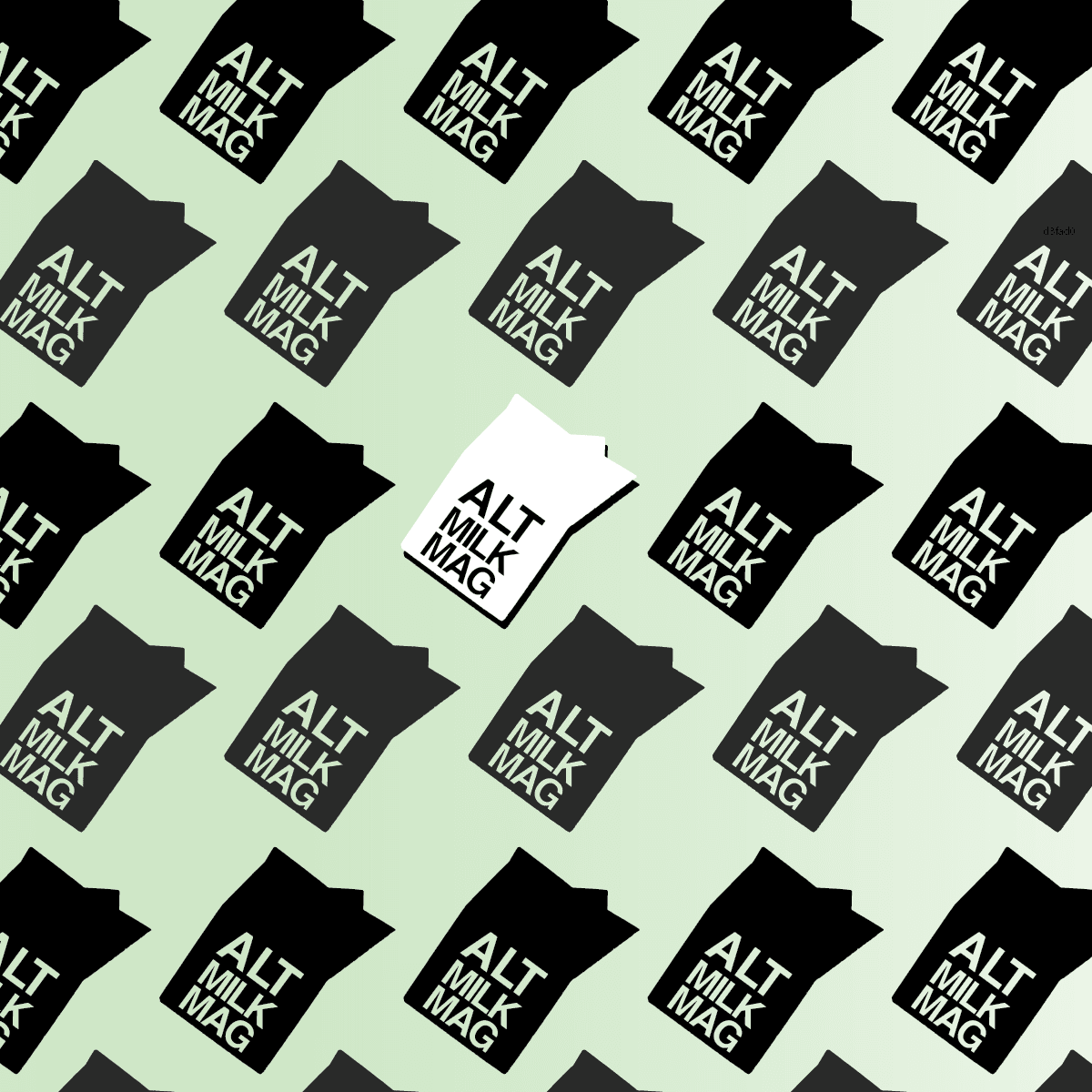
The logo—a stark, high-contrast milk carton—serves as both a literal and ironic symbol, playfully referencing alternative culture while critiquing consumerism. Typography is monolithic and compact, reinforcing the brand’s strong editorial presence, while the color palette relies on black, white, and muted green, maintaining a minimal yet intentional aesthetic. The grid-based repetition of the logo in brand applications adds an almost mechanical, DIY quality, reminiscent of risograph prints and punk poster layouts.
By grounding the identity in user-driven insights and iterative design testing, the final system balances rebellion with refinement, ensuring Alt Milk Mag feels as much like an art object as it does a publication. It’s a brand that doesn’t just exist—it makes a statement.


